Ed. Note: Welcome to new www.louisvillecoopers.com writer Josh Hinton! Josh will be covering match recaps for us in the upcoming season, but couldn’t wait to register his opinion on the new crest. Here goes:
Op-Ed: A Lexingtonian Supporter’s Views on the New Crest


First and foremost, I would like to thank Taylor Sorrels for letting me write this piece! For those who don’t know me, I am a sixteen-year-old OG supporter from Lexington, KY. I’ve been around since the initial announcement in the summer of 2014 and fell in love with the club once matches began in 2015. Like many of you, I show my devotion to the club in that I have spent more than I care to admit on kits and other club apparel! This, of course, serves as a good segue into the bulk of this op-ed ― my thoughts on the new club badge and, more importantly, the process by which it came about.
I was optimistic when the initial club colors were announced in 2014, because they were unique to the city of Louisville and the state of Kentucky. In a state divided between Kentucky blue and Louisville red, I felt like purple was a perfectly neutral option that was inclusive to both UK and UofL fans while enhancing the club’s quest to become Kentucky’s premier professional sports team, something that I believe all agree has occurred (much to the dismay of the Louisville Bats, which I could write an entire piece altogether on).
After building an identity from the ground up, the colors of purple and gold became synonymous with LouCity, to the point that I could wear my kits around Lexington and have fellow supporters recognize them. The purple and gold color scheme led to what were objectively some of the best kits in USL from 2015-2019, including those white and gold hooped change shirts — an iconic design beloved by fans. These, of course, will be nearly impossible to resurrect, as gold is unfortunately no longer part of our color scheme.
All of this, of course, leads me to the recently released “new look”. Hopefully it grows on me, but I believe it is a huge downgrade and a tone-deaf action by our front office. While some fans did not love the original crest, you would be hard pressed to find many fans who wanted the club crest or colors changed in such a drastic way. While Brad Estes said that the front office has “put a lot of thought and time into a clean, crisp design we think our fans will love”, to the best of my knowledge, fans were not made aware of ANY potential badge change until December 11th ― last Wednesday, via a cryptic Tweet. That’s five days before the new badge was announced. Five days before our club’s visual identity was brushed aside.
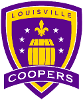
I eagerly kept up with this process with nervous anticipation and so far, have heard nothing that makes me believe supporters were part of this process. According to Brad Estes, this re-design “started in 2015” because it was difficult for them to reproduce on certain memorabilia. Not only is it a pretty minute, if not selfish, reason to completely change the popular logo, but I struggle to see how it is easier to print the new badge in its entirety on small items. The new crest is similarly busy and contains a small font along with other specific elements. Unfortunately, the first look at some of the new merchandise shows only the internal badge ― the half purple and half black shield with the fleur-de-lis and the thirteen circular stars ― on toboggans and hats. Instead of printing an established identity on apparel, the club now has to re-establish itself via the new logo.


The timing of this ― on the heels of the recent Charleston Battery re-brand (literally the next business day) only makes it worse for supporters. The Battery did an excellent job with their re-brand, creating a clean and fresh badge that was universally praised. They were able to modernize their design while retaining the color scheme and South Carolinian heritage.
Conversely, our “OG” badge, as it seems we are now calling it, was unique to Kentucky as well as to American soccer on the whole. All the design elements ― from the skyline to the bourbon barrel ― came together to create what I always considered to be a top five badge in all American soccer. We have replaced it with a generic, MLS-esque design that is bland and boring, not to mention aesthetically displeasing. To add, the obligatory new logo infographic was a complete bust (more so than they usually are), as the club insisted we have a 4-side triangle and a diagonal “horizontal line”.

Then, there’s the awful name change. I can’t even begin to express my disappointment that the club is cutting the full name of the city from our official logo and branding. It’s one thing for a club to go by a shortened version of the team name (i.e. Man United, Man City), but those clubs acknowledge that the abbreviated version of their club name is just that ― abbreviated. Imagine the reaction if Manchester City or Manchester United re-branded and used the abridged “Man” on their logo!
Similarly, the name “LouCity” is a fan nickname; nothing more. LouCity was a convenient way to address our club when talking to fans, write about the team, and discussing Los Morados to non-fans. With this re-brand, the club badge now reads “LouCity” instead of “Louisville City”, and it appears as though “LouCity FC” and “LouCity Football Club” will be the new common name.
All of this culminated with a disappointing and, in the eyes of many supporters, unnecessary re-brand that stripped the club of its identity. Our original color scheme, which was unique to American soccer (it has been incorrectly said that Orlando City SC use gold, even though they don’t use had gold on their kits or merchandise), has been replaced. A re-brand should be a happy and celebratory thing for fans, but this whole process was anything but enjoyable.