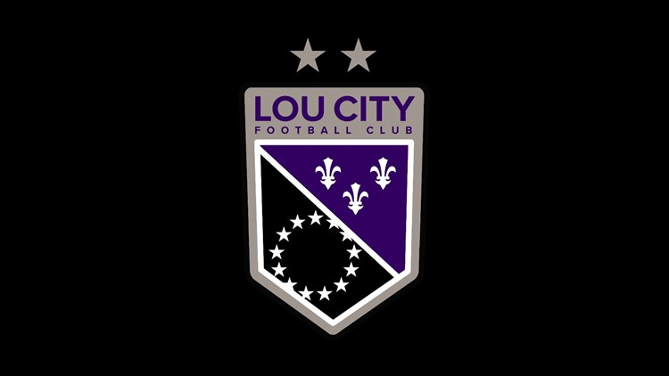
LouCity released the much (or not) anticipated new club crest today at a gathering at the team store at Fourth Street Live. The reaction on the internet was predictably very poor, ranging from “why did you do this” to “the new crest ran over my puppy.” Reaction from elsewhere (i.e. people who are not Big Mad Online) has been pretty positive, or at least inoffensive.
One of the explanations for the new crest is that the old one was very difficult to work with from a branding and marketing/merchandising perspective. The club, despite what folks are saying on the internets, spent hundreds of hours, and thousands of dollars with their local design and marketing firm to come up with the new look. “They wasted their money!” some might say. We’ll see, but I doubt it.
PERSONAL OPINIONS, COMING UP:
Brands are art, and art is subjective. I’m on record as not being in love with the original crest. It is too busy, it doesn’t look all that great on merchandise, but I was a lot happier with it than I was with the original one which was very, very very bad. Others, obviously and vehemently, disagree. That’s fine.
I honestly like it. Yeah, it’s a little too reminiscent of the Sacramento Kings and the LA Kings. I liked gold, too, but I get it. I know that if they tried to shrink the star circle so it fit into the bottom half it would look really cramped. But I love the homage to the old City of Louisville flag, something I wish more brands would bring back. I like the inner crest quite a lot, actually.
I’m less in love with the gray, but that’s okay. I’m not crazy about shortening the nameplate to just “LOUCITY” though I know it’s not ideal to try and cram “LOUISVILLE” into a space like that so it’s legible from further than 18 inches away.
I’m not here to defend anything, just to express my opinion. A lot of people had their minds made up before they saw the thing that they would hate it, and feel that the the club’s decision on the rebrand was a blood betrayal that will never be forgiven. I think that’s silly, but I do think it’s good that people care a lot about it. I don’t think that the club made the change without knowing that a lot of people would be angry about it, no matter what they did.
This is fine.
Also, as far as I know, the Coopers aren’t changing their crest, which is the best crest in these United States aside from maybe that Union Omaha owl one. VAMOS MORADOS.
